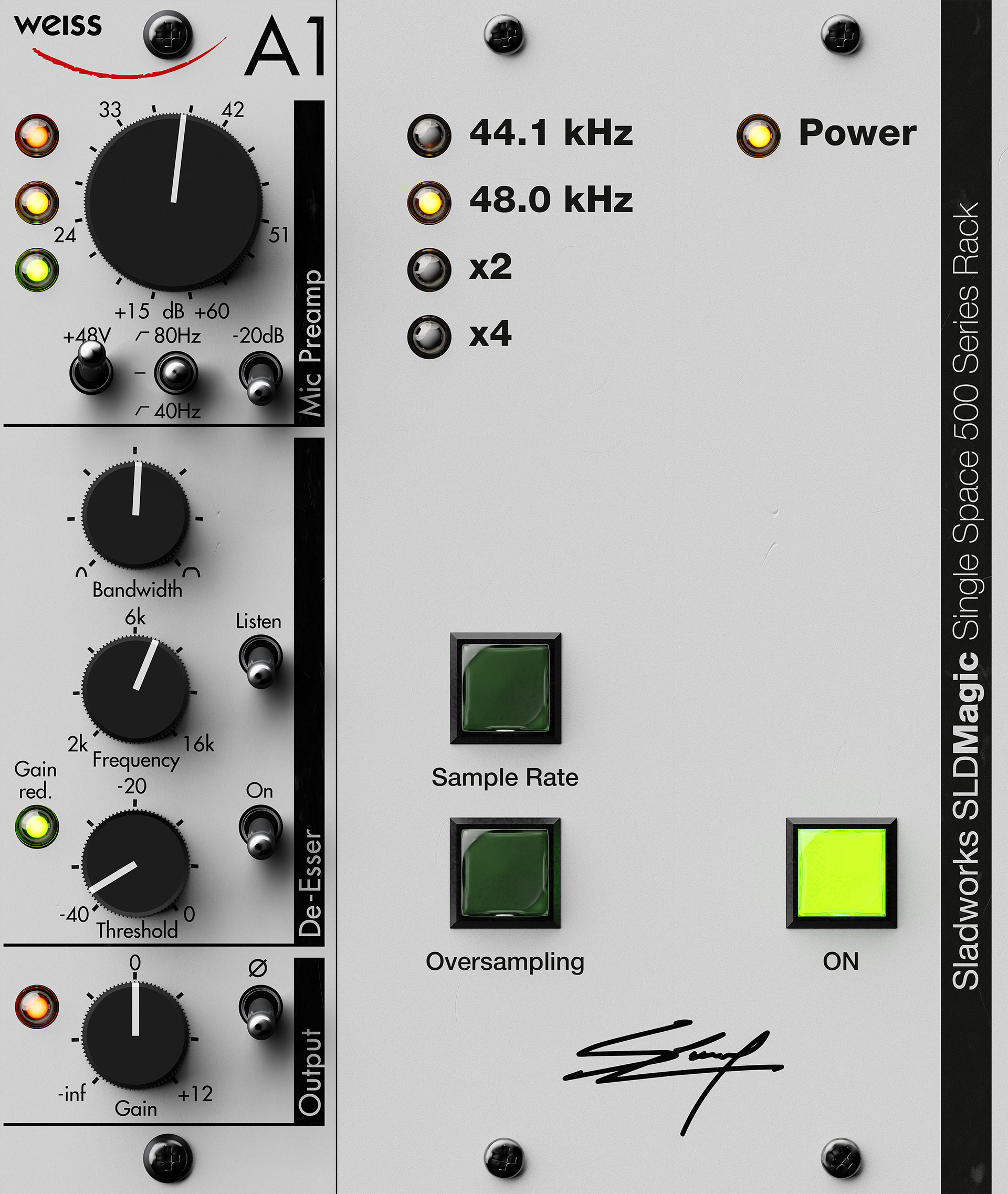
Sladworks Front End Strip MK1 is a personal audio design project developed as both a functional studio tool and an industrial-style interface study. The project was created to solve a specific workflow problem: bringing together input gain, selectable high-pass filtering, output trim, polarity switch and an extremely clean x4 oversampling de-esser inside one focused front-end processor, rather than spreading those tasks across several separate plugins.
The DSP structure was built inside Melda MXXX, using Melda modules as the processing foundation. The aim was not to create a full channel strip, but a narrower and more deliberate front-end stage: a processor intended to organise the signal at the beginning of the chain, remove unnecessary low-frequency content, control sibilance with precision, and provide final level adjustment in a compact and coherent form. The de-essing behavior was designed around clean, transparent filtering and controlled dynamic reduction, prioritising clarity and restraint over obvious coloration.
The visual development was treated with the same seriousness as the processing design. The layout was first constructed in Adobe Illustrator, where the interface was planned with exact vector dimensions and structured as a believable hardware faceplate rather than a generic software panel. From there, the design was rebuilt and assembled in Blender Cycles, where the unit was rendered as a photorealistic object with attention to material response, depth, lighting, and surface behavior. To achieve a more convincing final result, the interface was rendered in multiple passes, separating elements such as the base panel, knobs, switches, LEDs, and shadows. These renders were then refined and composited in Photoshop, where individual visual components were prepared for the GUI stage and integrated back into the working tool.
The result is a project that operates on two levels at once. On one side, it is a usable audio processor built around a real workflow need. On the other, it is a design object: a study in hierarchy, tactile control language, visual restraint, and the translation of hardware aesthetics into a functioning digital environment.
Important note: this is a personal, non-commercial project. It is not an official commercial product and was not developed for sale. It is inspited by the Weiss A1.
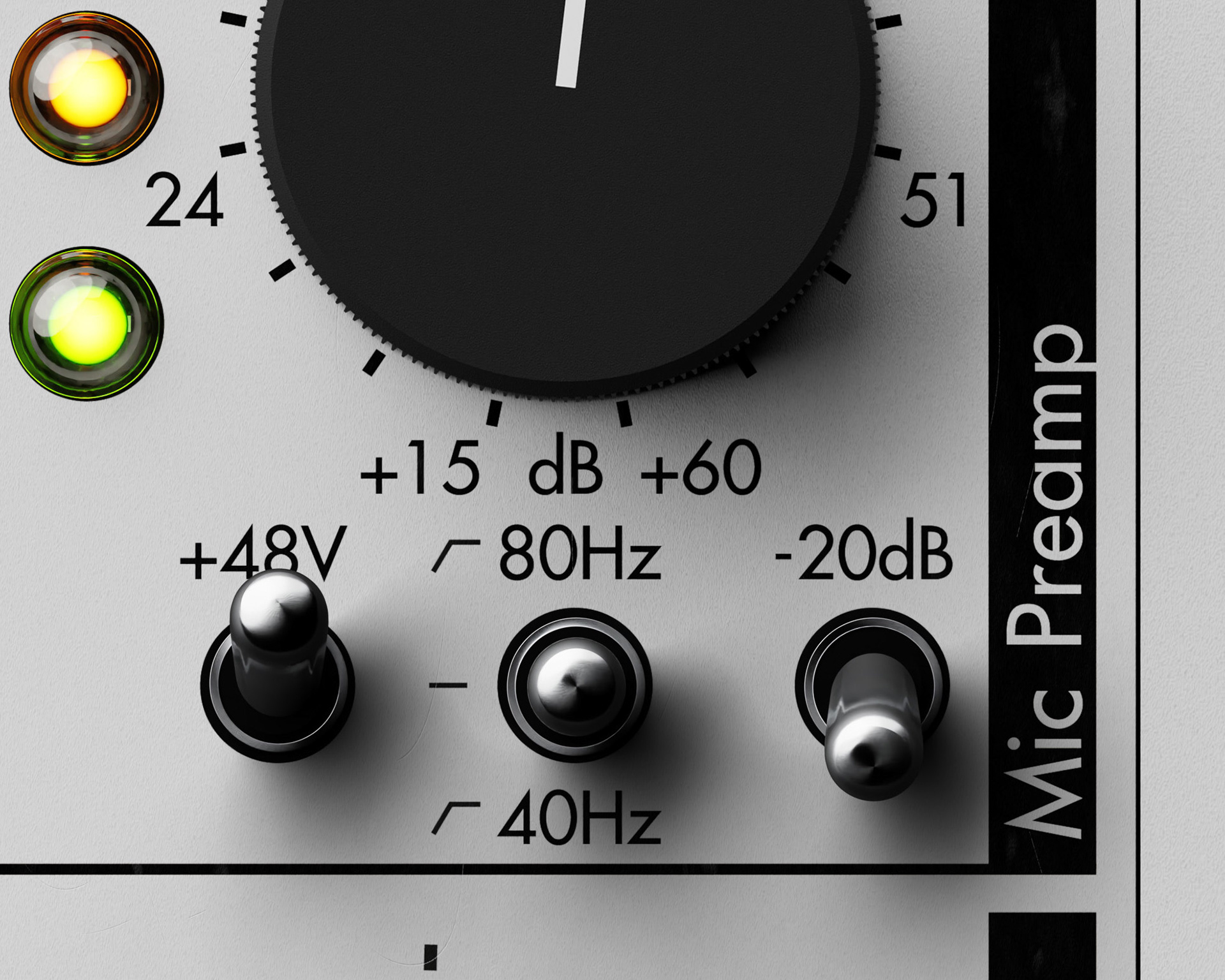
This close-up highlights the material work behind the interface. The surface was not treated as flat graphic color alone, but as a rendered object built with PBR-style material logic, where roughness, reflectivity, depth, and light response were all considered as part of the design. The goal was to give the interface the tactile credibility of real hardware rather than the appearance of a simple 2D mockup.
Particular attention was given to the contrast between surfaces: the matte painted faceplate, the denser black finish of the knob, the gloss and internal glow of the indicator lenses, and the harder reflections of the metal switch elements. Small differences in sheen, shadow falloff, and edge response were used to create separation between components and to make each part feel physically distinct.
This material treatment was essential to the project. The realism of the interface does not come only from layout and typography, but from the way each surface behaves under light. That physical response is what allows the design to function not just as a GUI, but as a believable digital object.
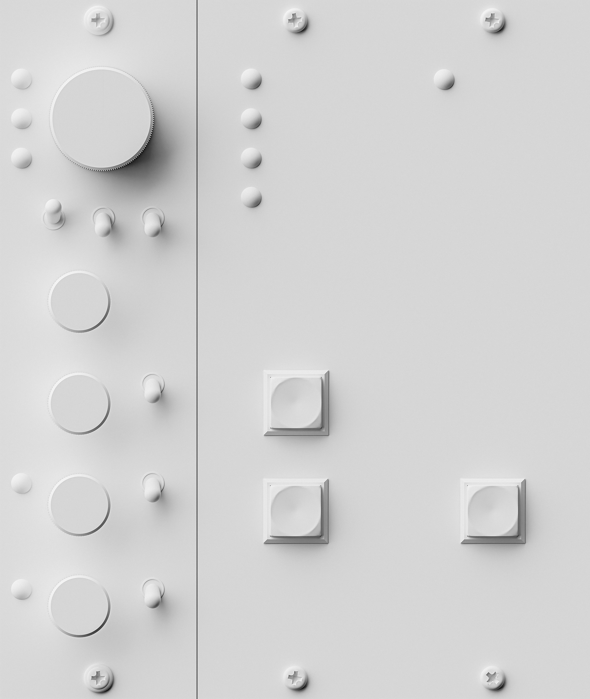
This material-override render isolates the project’s hard-surface construction by stripping away graphics, color, and emissive elements. In this view, the interface is reduced to pure form: panel breaks, screw placement, knob geometry, switch housings, lens volumes, and depth relationships between components. It shows that the object was not designed as a flat image first and “made 3D” afterward, but built as a spatially coherent piece of hardware.
The value of this view lies in proportion and structure. Without labels or material contrast to carry the image, the design has to stand on silhouette, spacing, chamfers, shadow behavior, and the physical hierarchy of parts. The large gain knob, the smaller control stages, the lens stacks, and the recessed switch geometry all remain legible through form alone, which is a strong test of the underlying modeling.
This render also highlights the industrial design logic of the project. Each component was modeled to contribute not only to realism, but to usability and visual order: controls are separated by depth, repeated forms create rhythm, and the object reads as an assembled front panel rather than a collage of graphic elements. In that sense, the white override functions as a proof of construction, showing the project as hard-surface design rather than surface styling alone.